Similarity Concept
However, for some topics it was not possible to adjust to the preferred structure due to technical or methodological constraints. Examples for this are in the “Coastal Themes” story. Here, the available information was not suitable to be presented in the usual style of the maps. For some other topics, presenting indices of qualitative nature, the presentation of difference maps and related information are not meaningful. For these topics only the 30-year ensemble mean for the 1971 to 2000 reference period and for the +2°C global warming period are shown.
To support the reader of the atlas, maps and describing text sections are shown at the same time. This mode of presentation helps the user to understand what kind of information is provided in the respective maps.
Mandatory Maps
For the standard set of maps the following information is provided: the 30-year ensemble mean for the 1971 to 2000 period and the +2°C global warming period, respectively. Furthermore a map of the climate change signal for the +2°C global warming period is shown as well as the bandwidth of projected changes being represented by the 20th, 50th and 80th percentile of change. Finally, a map of the ensemble agreement based on the number of projections agreeing in the direction of change is given.
The ensemble mean climate change signal depicted in the atlas has been derived by calculating the ensemble mean of the simulations for the reference period as well as for the +2°C global warming period. Afterwards the ensemble mean change has been derived by subtracting the simulated mean for the reference period from the mean of the +2°C global warming period. Additionally, the climate change signal for the +2°C global warming period has been calculated for each of the simulations individually, thus, to be able to calculate the percentiles of change representing the bandwidth of projected changes and the ensemble agreement. To exclude single outliers only the 20th, 50th and 80th percentile of projected changes are shown. For some parameters, the seasonal distributions of the current and future periods as well as their changes are also shown.
Recognizable Text Structure
The text structure in all topics is kept similar to help the reader to focus on the content. The structure of the text explaining each topic is identical across topics, with key messages in the beginning followed by three guiding questions:
- Why is the content of this map important?
- Which sectors are affected by this result?
- What is shown on the maps?
More details on the background information and methods used to compile the findings of each topic are provided in the “Details and further information” as well as the “Additional information” section. Here, other explaining elements such as graphs and tables or references can be included.
Recognizable Scale Bars
Each variable is shown as an ensemble mean for the reference period and the +2°C global warming period. Although the scale bar is individual for each topic it remains the same within one topic for both periods shown.
Climate change signals
The scale bar colors applied to depict the climate change signal are the same for all topics and stories. Greenish colors always indicate a projected DECREASE in a specific parameter/index, while purplish colors indicate a projected INCREASE.


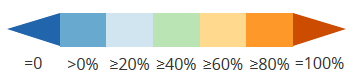
Ensemble agreement
The scale bar for the ensemble agreement is displayed in percentages, as the number of available simulations is not the same for each variable.